


Project
I took the lead at Columbia Sailing School's annual Raise the Sail; I crafted impactful print materials detailing auction items, menu highlights, and the event's overall aesthetic. Through a blend of creativity and functionality, the resulting promotional materials immersed attendees in the sailing community's spirit, contributing to the event's success.
Summary
In this project, my role centered on crafting compelling print materials that intricately detailed auction items, highlighted the event menu, and embodied the overall aesthetic. This design initiative played a pivotal role in shaping an immersive experience for participants, allowing them to connect with the sailing community's vibrant spirit seamlessly. The resulting promotional materials not only contributed to the event's success but also served as a visual testament to my commitment to user-centered design. This project stands as a showcase of my ability to create cohesive and engaging experiences that resonate with diverse audiences.
Client
Columbia Sailing School
Roles
Print Design
Copywriting
Creative Direction
Main Goals
No. 1 Engagement
To enhance attendee engagement by creating visually captivating print materials that drew participants into the vibrant world of sailing, fostering a sense of connection with the event.
No. 2 Communication
To effectively communicate crucial details such as auction items and event highlights, ensuring clear and compelling messaging through the design of print materials.
No. 3 Experience
Create an immersive brand experience to embody the unique aesthetic of the sailing community, establishing a cohesive visual identity that resonated with both participants and sponsors.
Process
A systematic approach was required to design Raise the Sail. I started by comprehensively understanding the event's goals and audience expectations. Drawing from my upbringing in the sailing community, I leveraged my knowledge to deepen research into the appropriate aesthetic for this project. Utilizing creativity and an iterative design process and incorporating collaborative feedback, I crafted impactful promotional materials that truly embodied the essence of the sailing community. This approach played a pivotal role in the success of the fundraising gala.
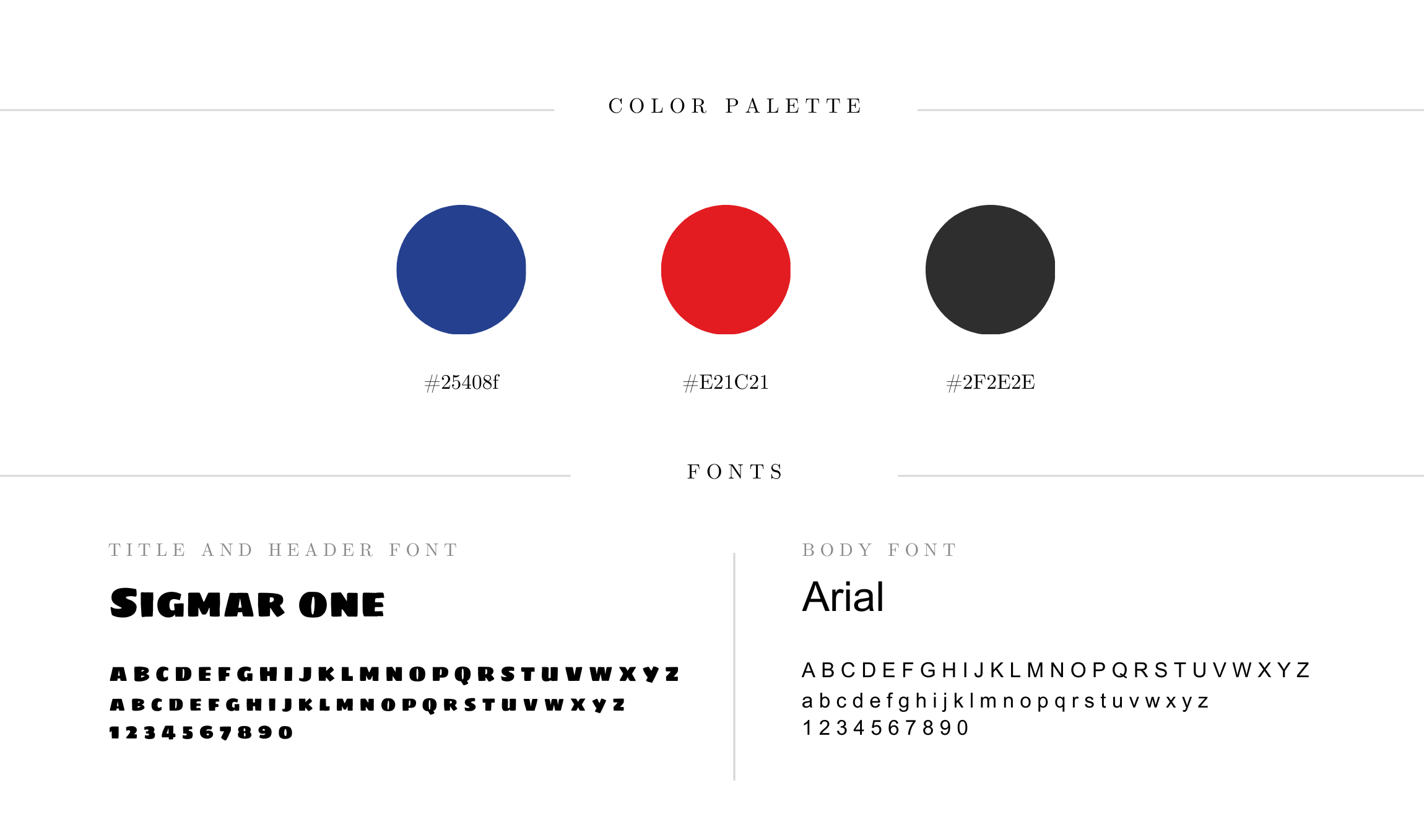
Visual Identity
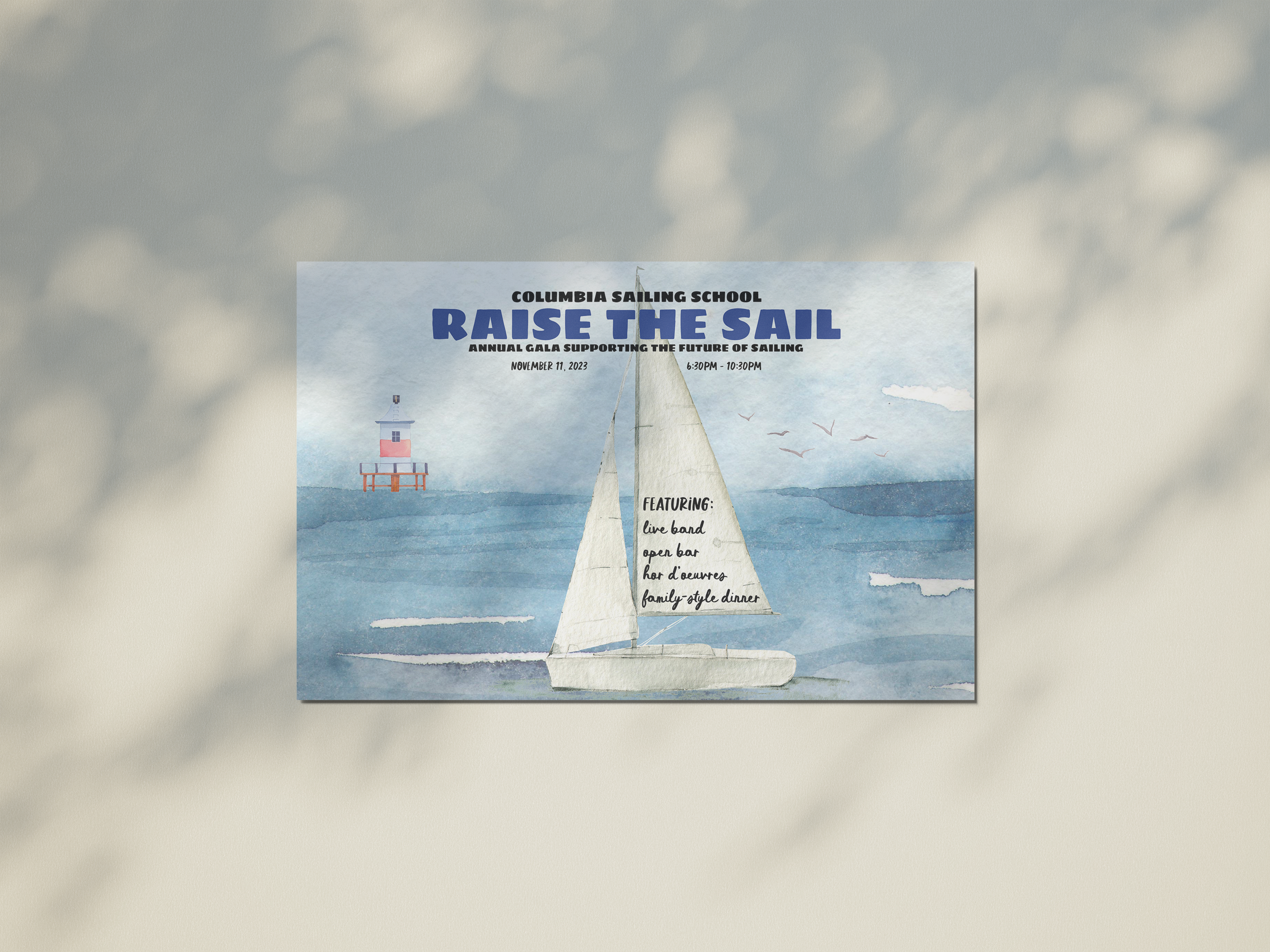
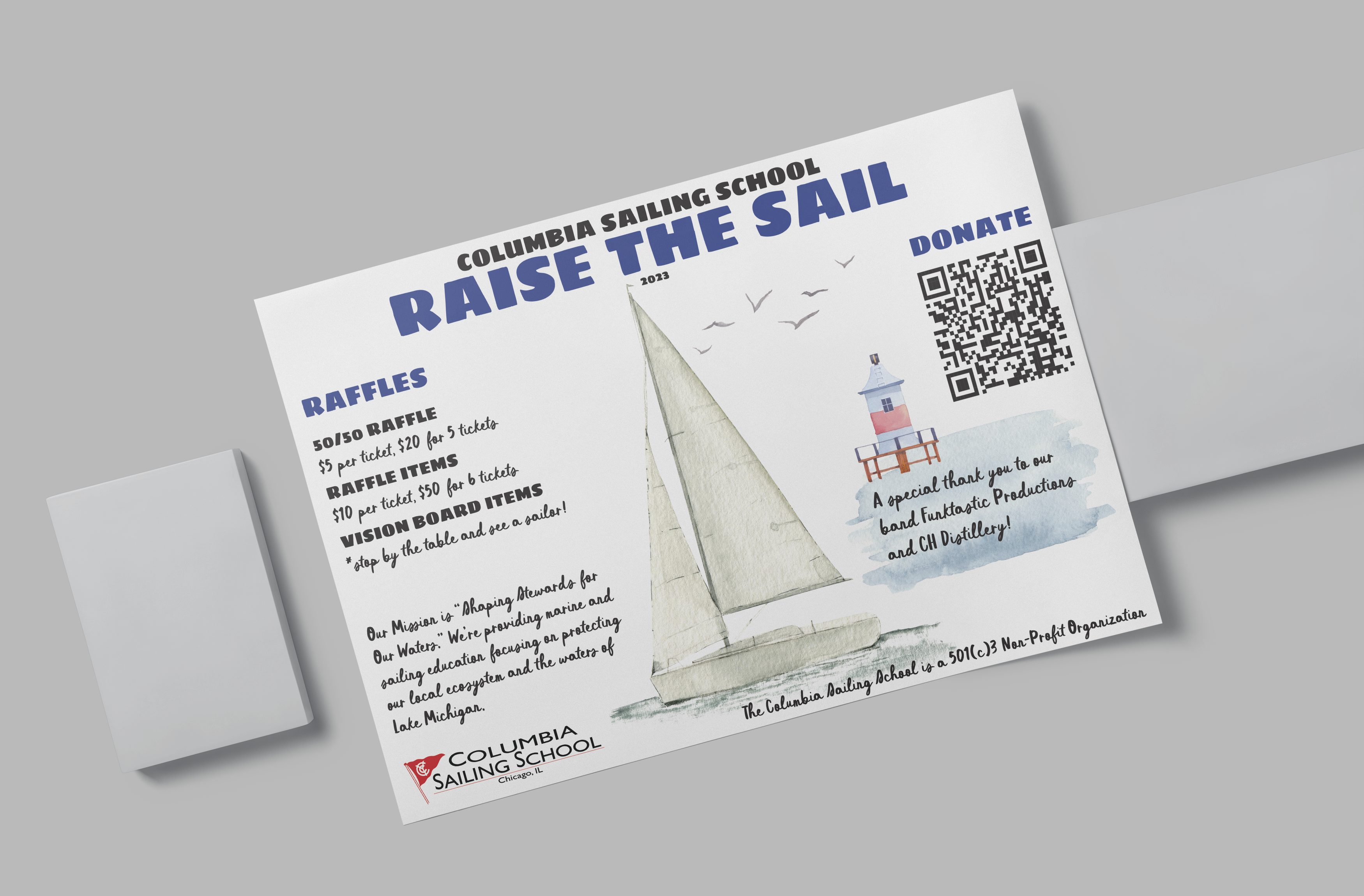
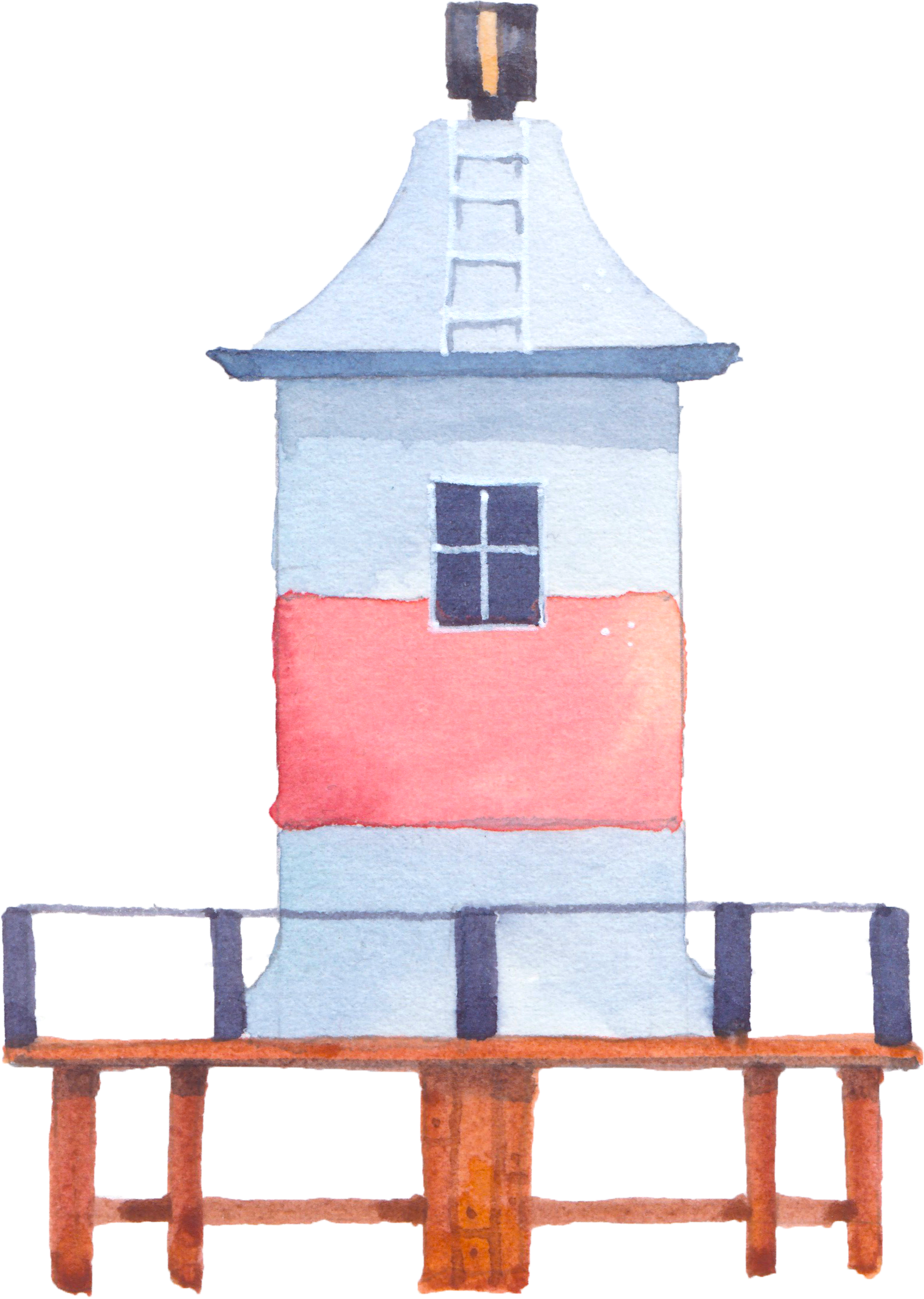
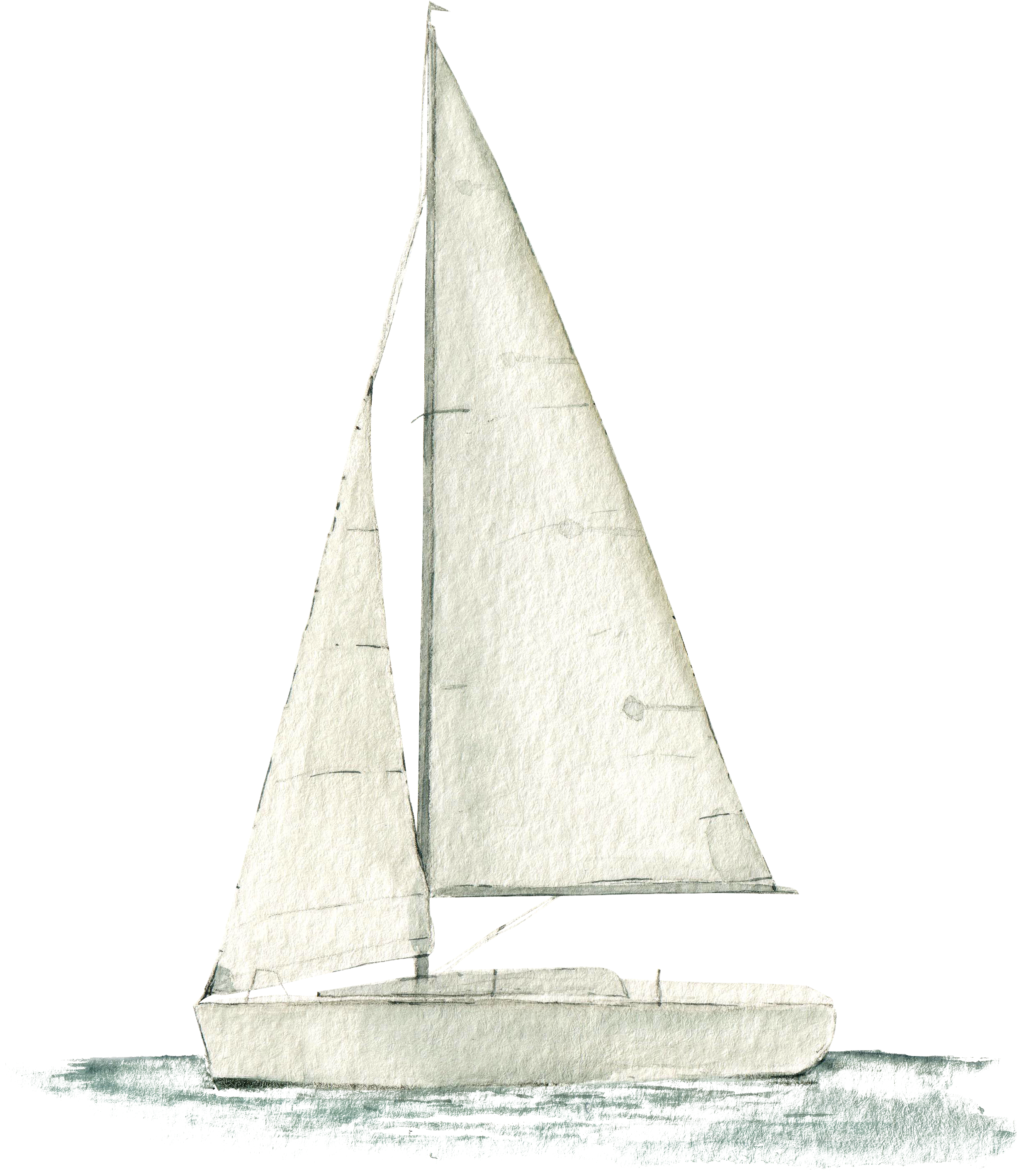
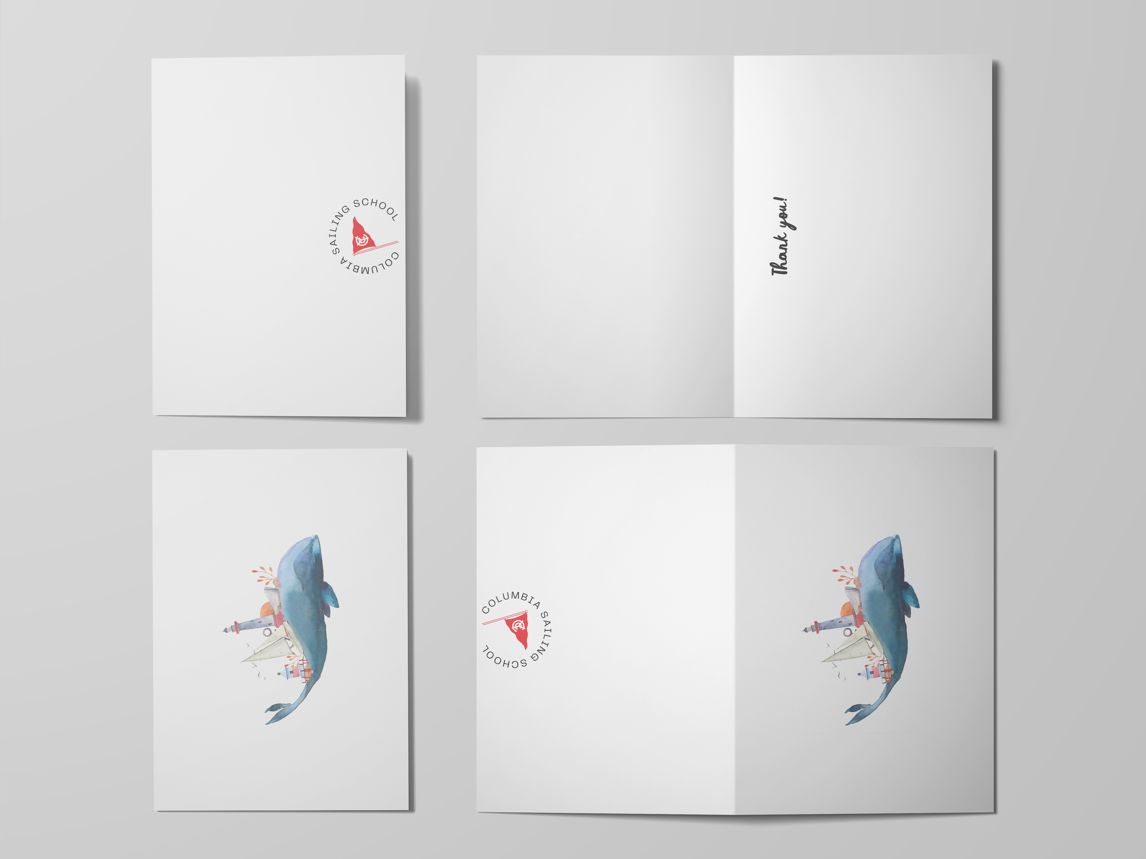
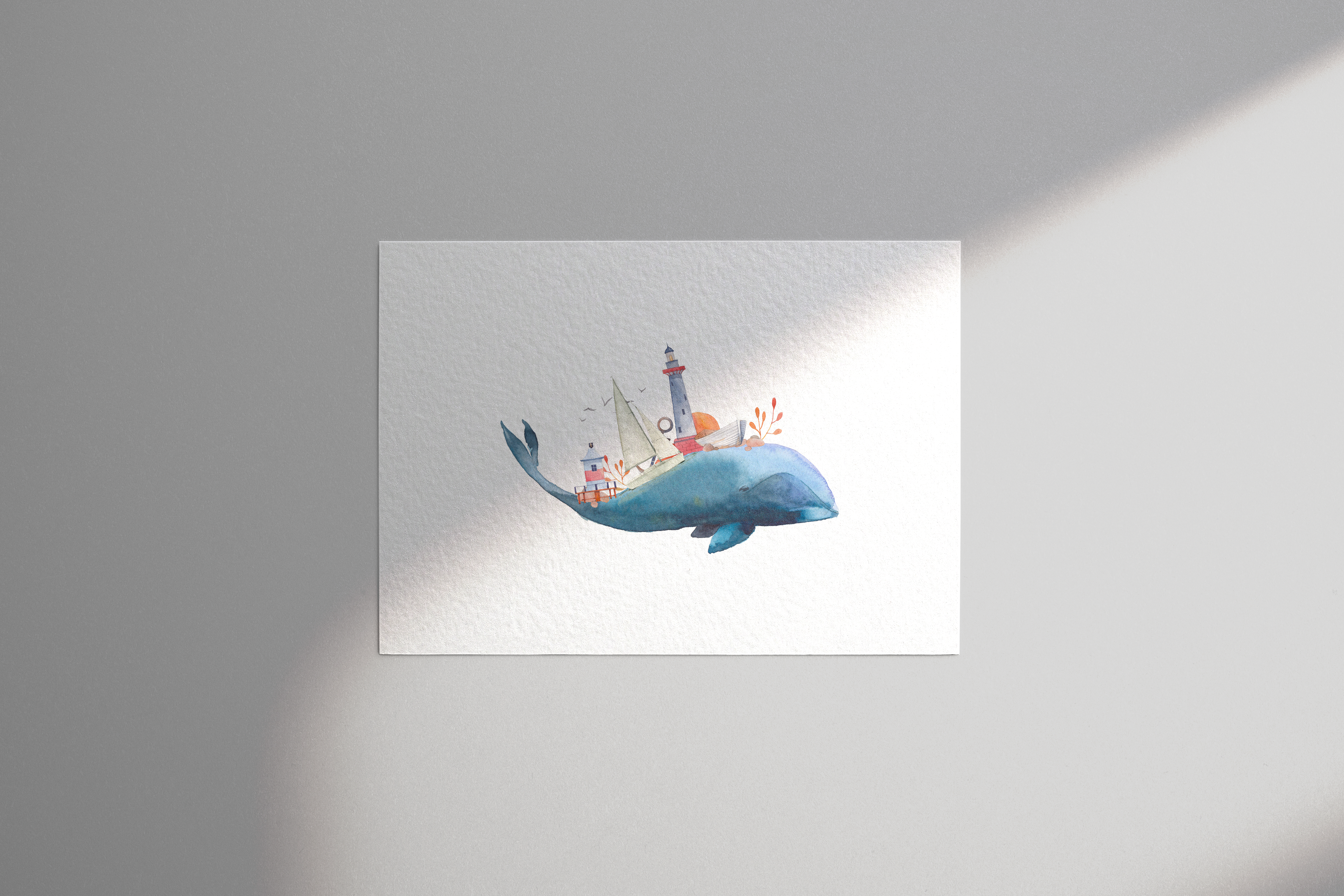
A unified narrative was crafted by integrating recurring images throughout all the products. The sailboat's image symbolized the school's enduring journey, while the lighthouse acted as a guiding beacon, embodying safety and community. These reiterated images created a purposeful and memorable visual language, firmly rooting the event's identity in the hearts of participants and sponsors alike. The use of red and blue colors aligned seamlessly with the sailing school's established color palette on its website and logo.
First Insights
Embarking on the design journey alongside the board members of the Sailing School's fundraising committee unveiled a crucial initial insight — the collaborative and ever-evolving nature of the project. Particularly noteworthy was the challenge posed by last-minute finalizations of auction items, leading to the dispersal of text across various printed products. This highlighted the need for adaptability and streamlined communication channels to navigate real-time changes and maintain a cohesive visual narrative effectively. The experience underscored the importance of a flexible design approach capable of harmonizing diverse elements, even amid evolving details and shifting priorities.
Experience of Products
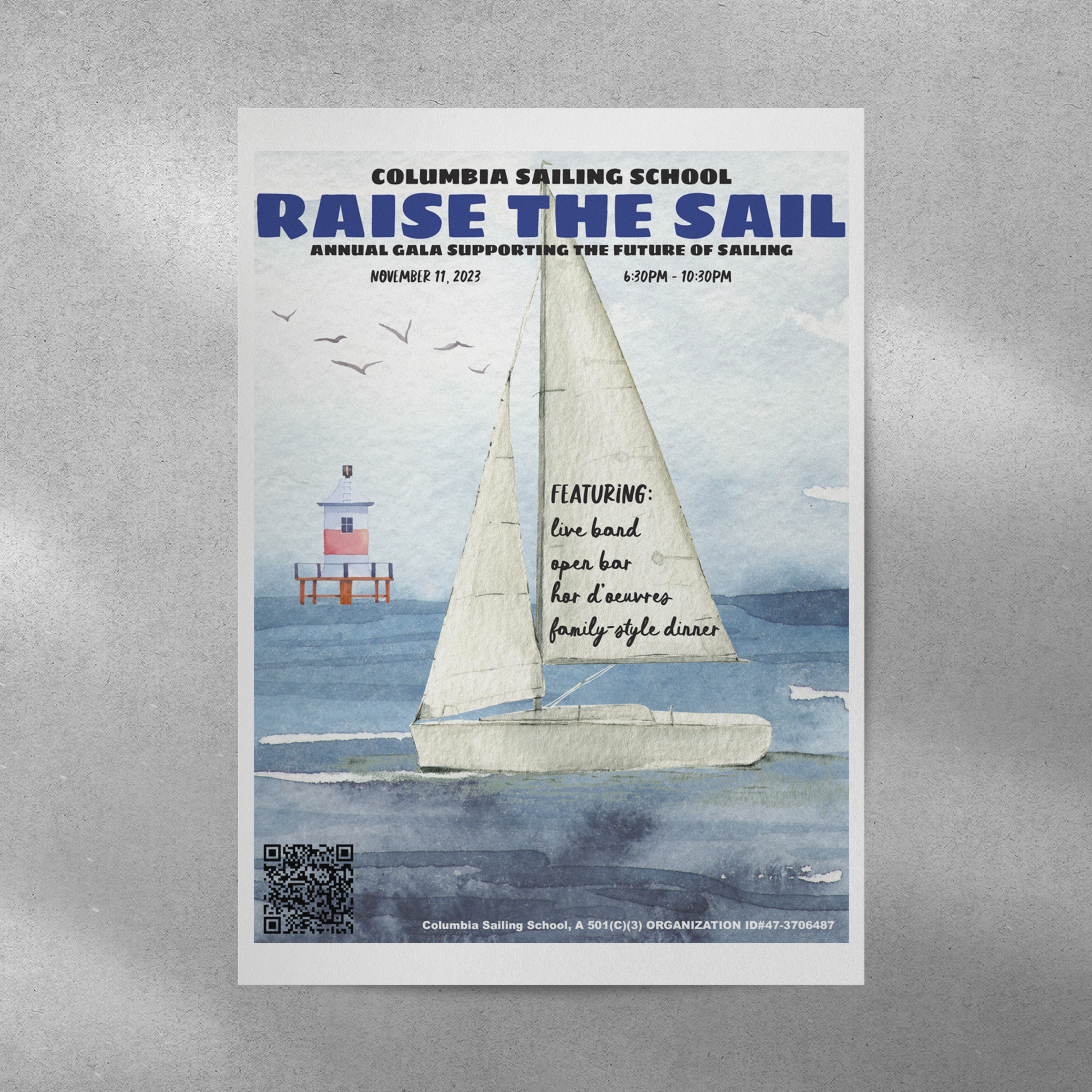
① Promotional Material
The materials successfully communicated the upcoming event to clients through a visually striking poster, engaging social media posts on platforms like Facebook and Instagram, and targeted email campaigns. The poster served as a focal point, while dynamic social media content ensured broad visibility and personalized email campaigns directly reached the audience, enhancing anticipation for the event.
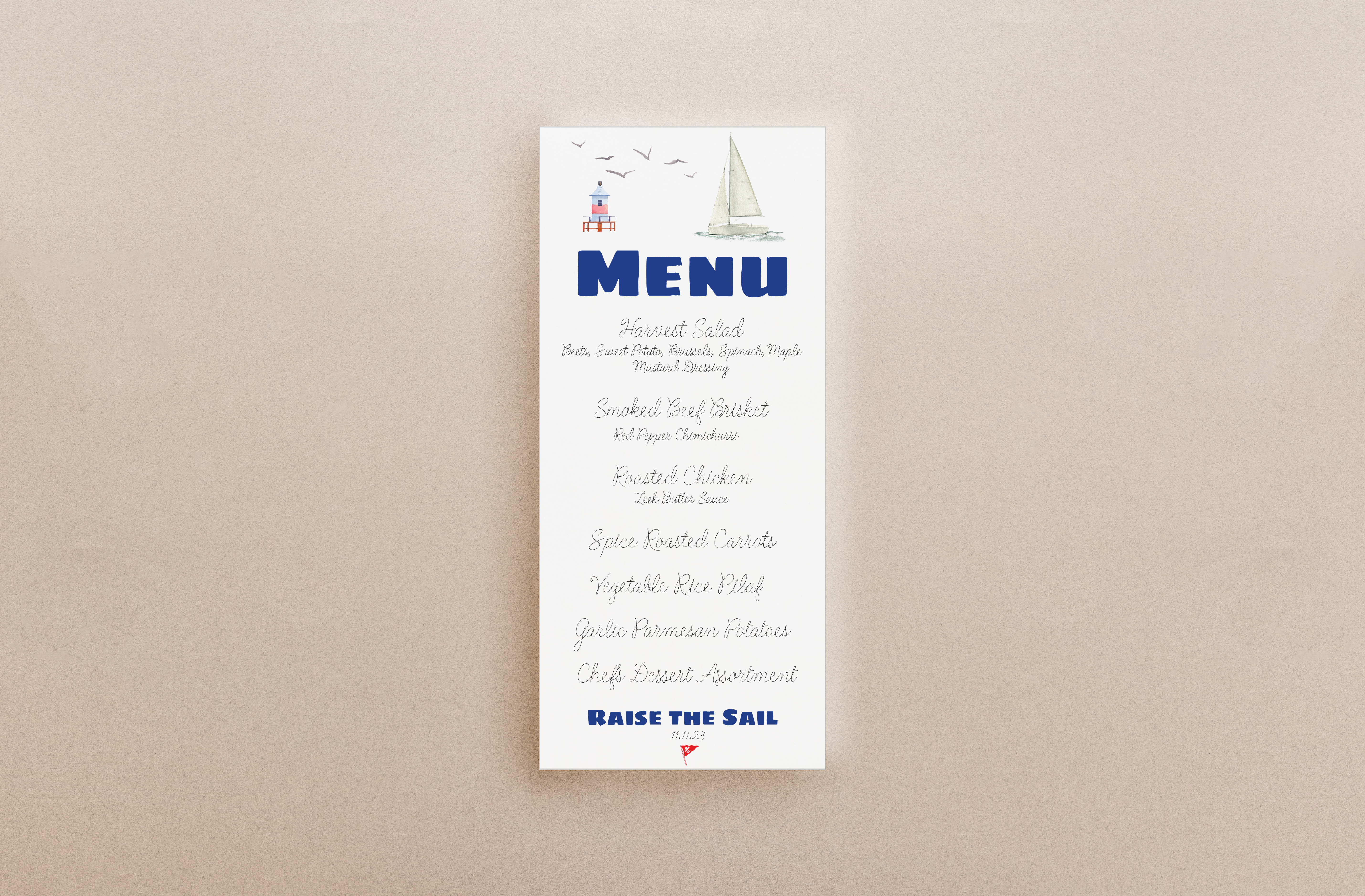
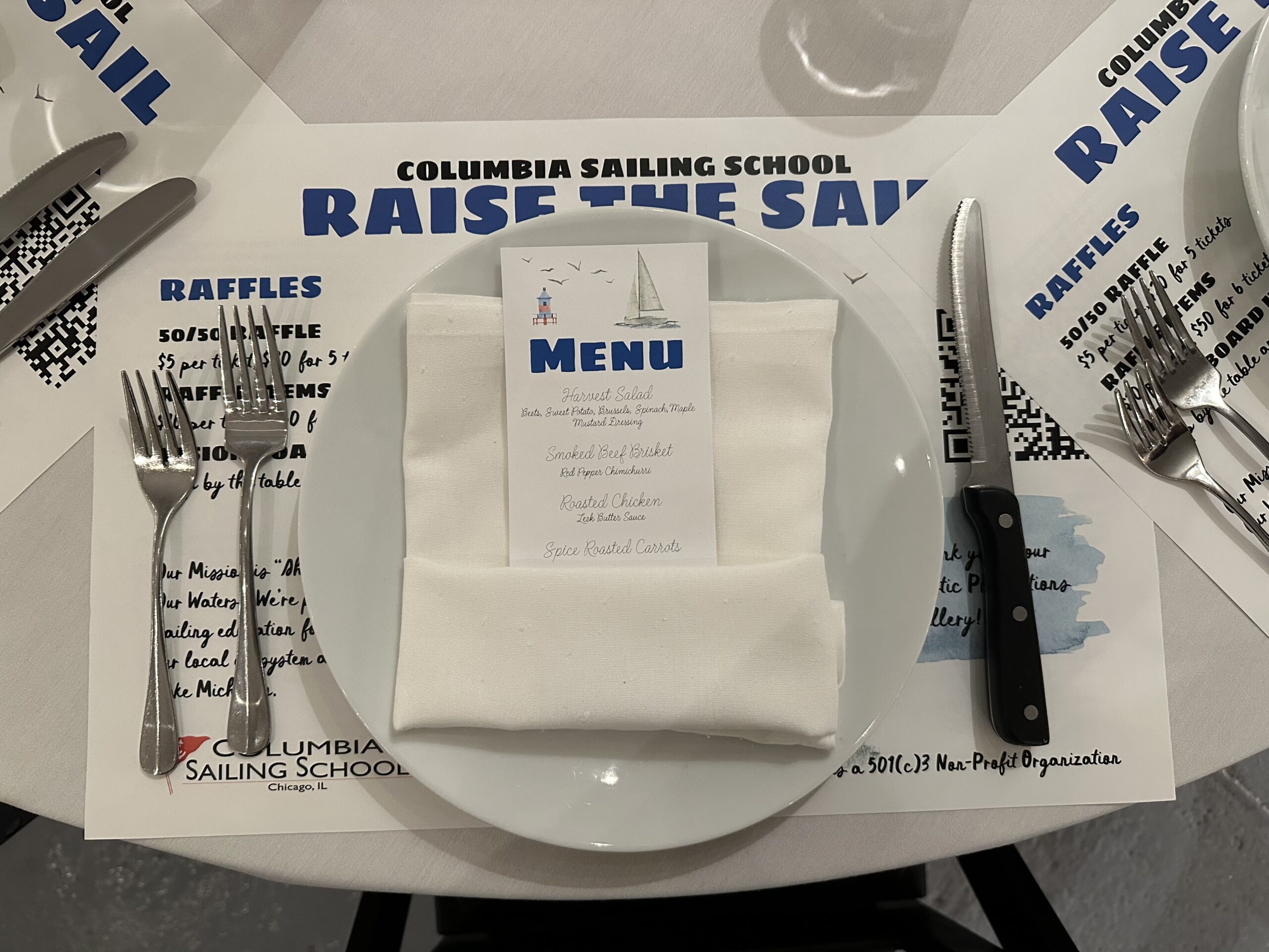
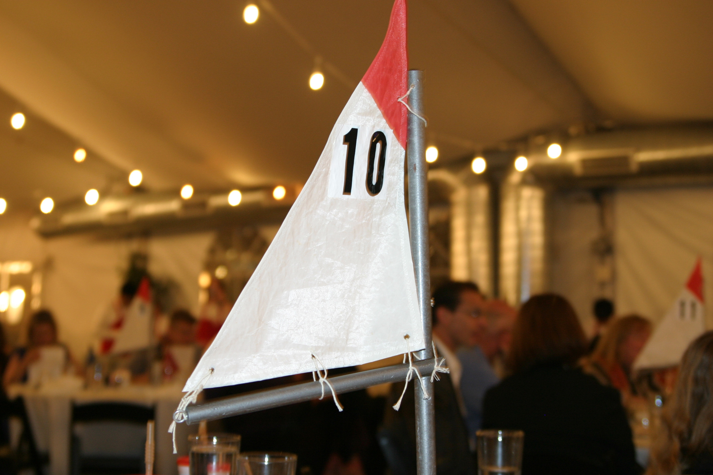
② Placemat and Menu
Each attendees recieved a platemat and menu at their seat, ensuring they are well-informed about the all aspects of the event and how they can contribute, enhancing their engagement and support.
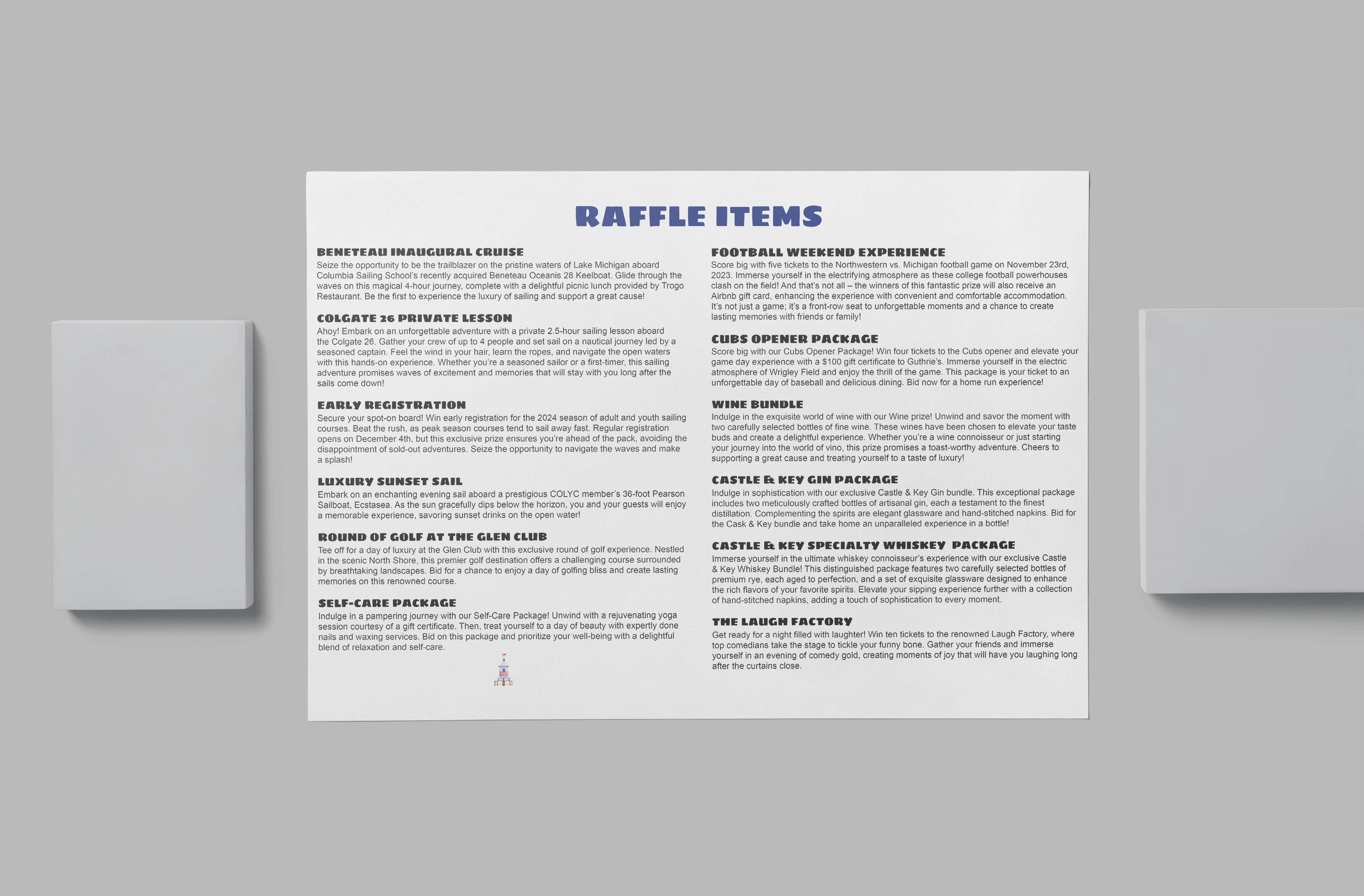
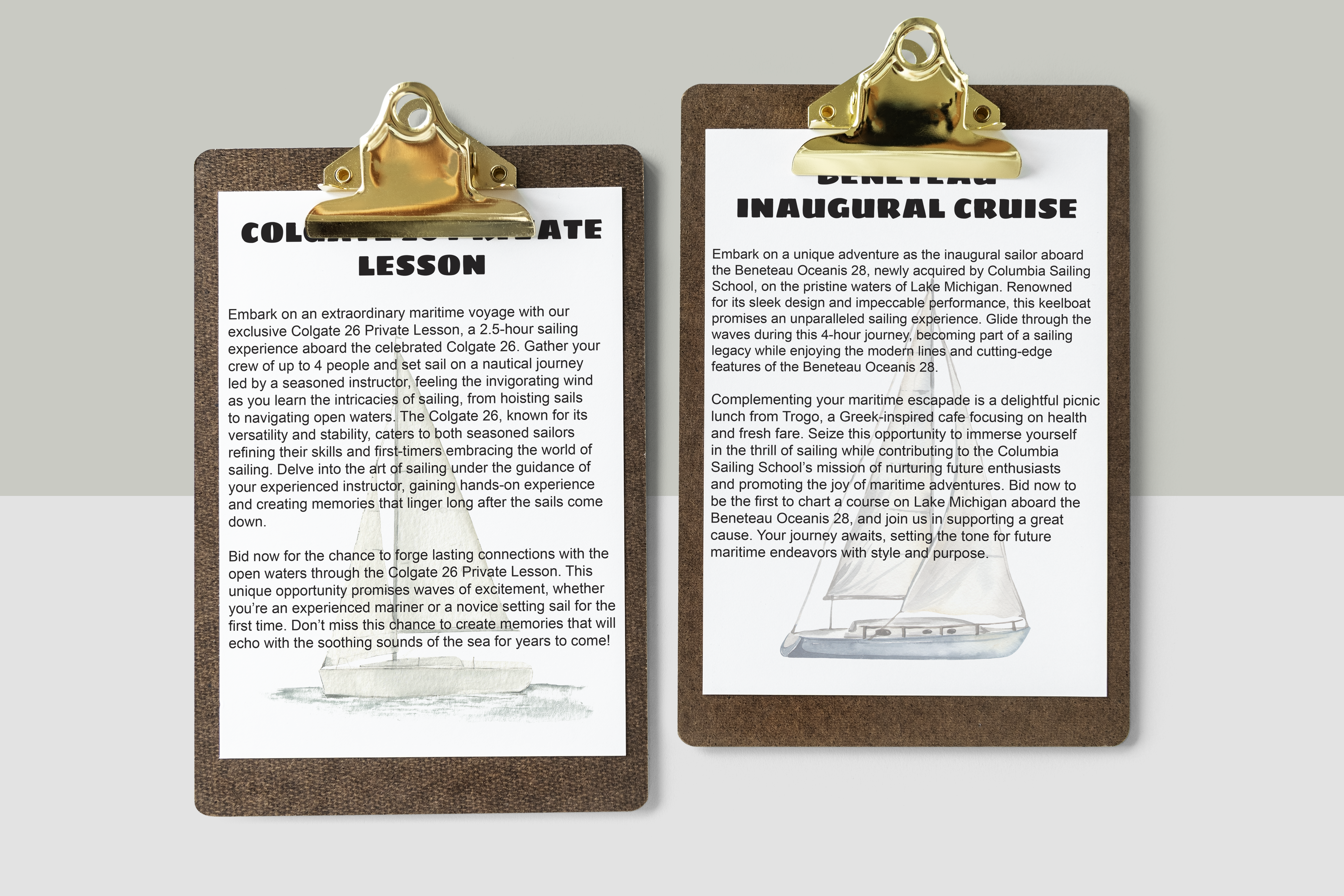
③ Raffle Items
Instead of doing bidding, a selection of raffle items items were avaliable to buy tickets for. There was a table with descriptions of all the items, and bowls to put tickets in. Additionally, item descriptions were avaliable on the back of menus.
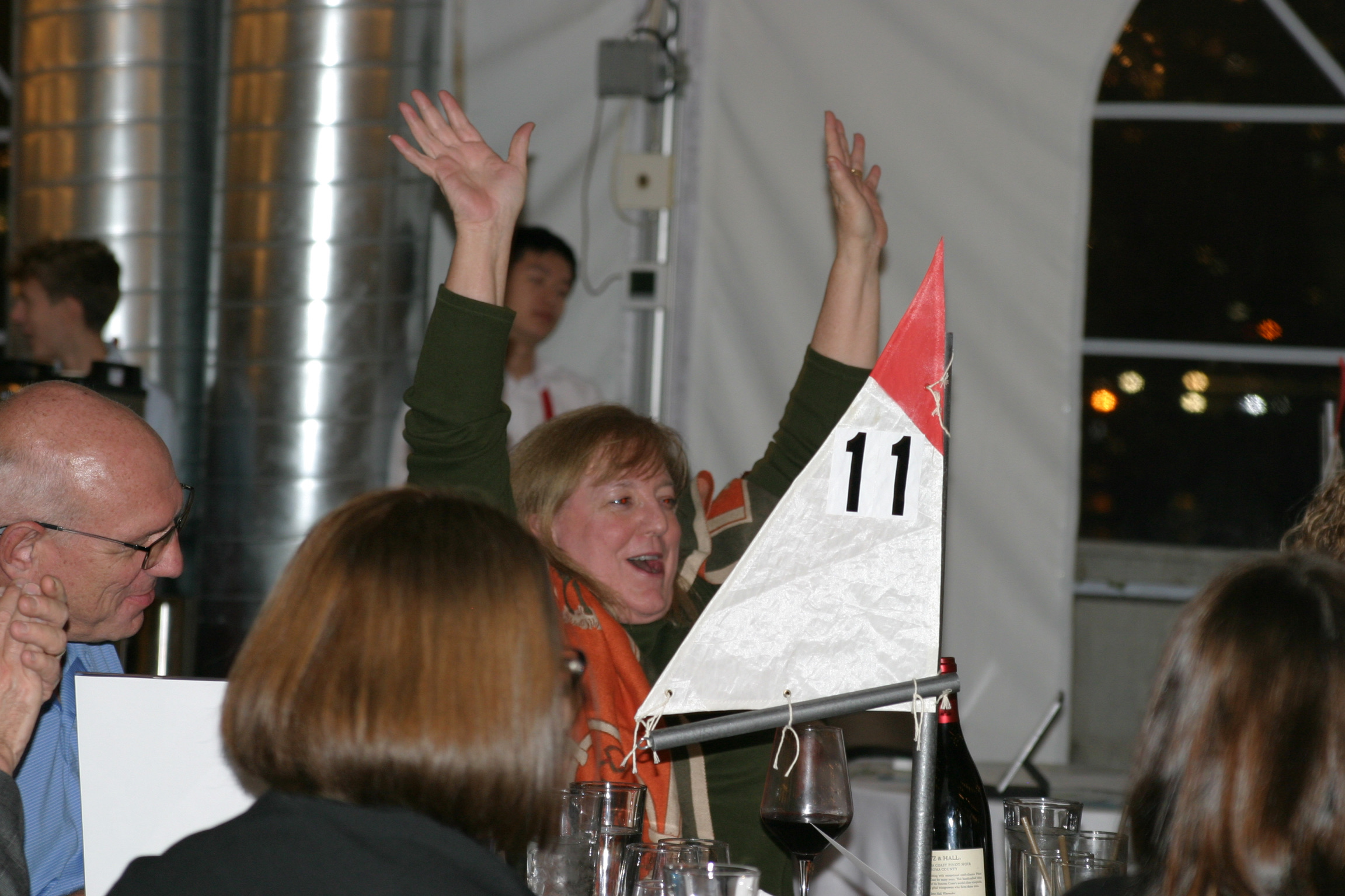
④ Call to Action
Attendees were encouraged to support the Sailing School's mission by donating. This included purchasing a vision board item, directly donating, Raising the Sail in a paddle style donation round, or through a 50/50 Raffle.
Thank You Card
The card was crafted to express gratitude after the event, acknowledging attendees for their generosity beyond ticket purchases. The card prominently showcases a main image, skillfully incorporating the recurring sailboat and lighthouse into the graphic, reinforcing the event's maritime theme.
Results
Engagement
By effectively presenting auction items and the event menu, the materials fostered a deeper connection between attendees and the sailing community. This engagement led to more meaningful interactions and stronger support for the sailing school, as participants felt more involved and invested in the event’s success.
Awareness
The visually striking and well-organized print materials significantly boosted the visibility of the sailing school, drawing more attention to its mission and programs.
Fundraising Success
The cohesive and appealing design of the promotional materials contributed to a more successful fundraising effort. Clear communication of the event’s goals and opportunities to contribute helped maximize donations and support for the sailing school, directly benefiting its programs and operations.
Takeaways
No. 1 Design Adaptability
The dynamic and collaborative nature of the design process underscored the importance of agile collaboration. For future projects, fostering real-time communication channels and establishing transparent decision-making workflows with stakeholders can enhance efficiency and responsiveness.
No. 2 Text Management
The dispersion of text across multiple printed products identified a need for improved textual management strategies. For future endeavors, implementing a centralized system for content control and version tracking can contribute to textual consistency, even amid evolving details, leading to a more polished and cohesive presentation across materials.
No. 3 Last-Minute Changes
The challenge posed by last-minute finalizations of auction items highlighted the need for proactive planning to accommodate such changes. Establishing a contingency plan and anticipating potential late-stage adjustments can streamline the design process, ensuring a more seamless integration of dynamic elements.
SELECTED WORKS

Racing Rules of Sailing SeminarPrint Design

Giving TuesdaySocial Media

As We Race to the ShorePhotography

Classic Cambodian Films ScreeningPrint Design

Nakry NakryPhotography
© 2024